Comcast just announced a new logo in December 2012. The combination of the cable company Comcast and the entertainment provider NBCUniversal (which Comcast purchased in 2011) created the need for a new identity that neither logo alone could provide.
The logo redesign is a straightforward combination of the two existing logos and suggests to employees, stakeholders and customers that they are really one entity. Try imagining your local cable driver working for the same company as judges on “The Voice” or creators of thrill rides at Universal park in Orlando and you get an idea of the need to tie it all together. The stronger capital letters and more modern font are really the only changes (I can only guess what the design firm charged them for this). Here is how this new logo evolved:

In August 2012, Microsoft announced a new logo as well. The logo integrates the Windows tiles into the Microsoft word-mark. The suggests the integration of Windows (and new Windows 8 version) into everything Microsoft software touches – computers, tablets and Windows phones. This signals one seamless entity into the future.
Both Comcast and Microsoft each project a single integrated consumer experience rather than a combination of elements. Coincidentally, there is strong similarity between the two companies’ identity evolution in both color and symbol integration
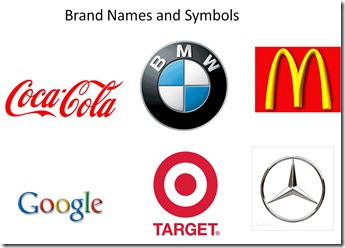
In an earlier post, I showed the 3 common approaches to logo design. The first is the standalone word-mark or name. The Coca-Cola and Google logos, shown below, each has distinguished and memorable stylization – a downside to a word-mark when it is used in markets that do not use a Roman alphabet. The second approach is the integration of the brand name as part of a larger design element. BMW and Target logos are an example of this. The third approach is moving the identity away from words into symbols only. This stage cannot occur until the point at which the association is so fixed in the mind of the consumer that the name is now redundant to the image and can be dropped. McDonalds and Mercedes are good examples.

The new Comcast and Microsoft corporate logo evolutions lock in a visual element that will come to be synonymous with the corporate identity. Over time the symbol can be used alone for the companies’ identity. In other words, a peacock will mean Comcast (not just NBC), and the tile box will mean Microsoft (not just Windows).
Does your logo reflect your companies future?


I do think logos are important, but I am always amazed how much time and money goes into brand refresh vs. brand delivery if you catch my drift.