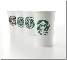
In marketing departments across the world this week, the buzz around the water cooler was about the new Starbucks logo. We are kind of nerds by nature and are fascinated with this stuff. Why would a successful brand change its logo? The risks of alienation and lost sales are huge – just look at “The Gap” which changed its logo for about a month and then changed it back after consumer outrage. Well, you can bet that there will be outrage over this logo change too, but this one is a step in the right direction.

Why do it? Pretty simple actually. First, by taking the word “coffee” off, it allows the brand to move beyond coffee into a broader world of food, and retail experience. Coffee is not really a long term growth market anyway, while experience is. Their wonderful coffee alone can’t really differentiate among the thousands of great coffee houses their rise to fame has brought along with it. Second, it may help broaden an international perception by being less “American” and Western. Many non-English speaking countries struggle with English words. Think China, Japan, Arab countries, Greece, etc. – where they don’t even use a Roman alphabet so the words are virtually meaningless and very “American” – not always a good thing for local coffee tastes. Coffee is not exactly native to USA and the concept of a great Seattle coffee house may not be a strong motivator for people living in Brazil or China. Third, pictures stay in your mind far longer than words. Ever forget someone’s name but remember the face? Symbols are like that too.
Just so happens that the symbol here is that of a Siren (Greek maritime mythology of a mermaid women with two tales – that’s what she is holding in her hands). A great deep dive on the history of the Starbucks logo is done on this link to the Deadprogrammer blog here.
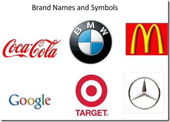
There are basically 3 approaches to brand identity. The first and most common is in using your name as your logo. Many global brands still do this – examples being Coke and Google. There is only one downside here as mentioned above and that is the lack of understanding in places that do not use a Roman alphabet and therefore cannot begin to pronounce the name. Here, these companies have had to use local alphabets. The second approach is the integration of the brand name as part of a larger design element. Examples here are of BMW and Target. The third approach is moving the identity away from words into symbols only. This stage cannot occur until the point at which the association is so fixed in the mind of the consumer that the name is now redundant to the image and can be dropped. McDonalds and Mercedes are good examples
The risk for Starbucks at this point, is that the name and the new image are not yet redundant globally. The name Starbucks and the updated Siren should live together for a while more until each are are happily etched in the mind of the consumer. Dropping “Coffee” is smart, dropping “Starbucks” is not yet smart and should not be done. The siren is not yet memorable like the McDonald Arches and the risk is that dropping both the Starbucks coffee, the circle and changing the graphic image all at the same time is a step too far.
In my humble opinion there is an interim step. I would have kept the Starbucks name, reduced the typeface size, and kept it in the circle but now below the new image. The other approach would be to take it out of the logo altogether, and write it below the new image. Either way, this would allow for the eventual move to a symbol only approach.
And that is my water cooler opinion. Now back to work…


Very helpful information. A logo should be the personification of your company identity.
Food Packaging
[…] an earlier post, I showed the 3 common approaches to logo design. The first is the standalone word-mark or […]